Upset Visualizing Sets?
Data Visualizations that summarize customer overlap between brands are particularly relevant for brewery distribution, marketing and collaboration decisions.
How many people that like Brewery A’s IPA also like Brewery B’s IPA?
Despite, all the success in some of my favorite memes, VENN diagrams are reasonable for visualizing overlap, but they are usually awful at quantifying it (because circles). The reality is, there aren’t a lot of great visualization options for overlap of sets because of the inherent complexity.
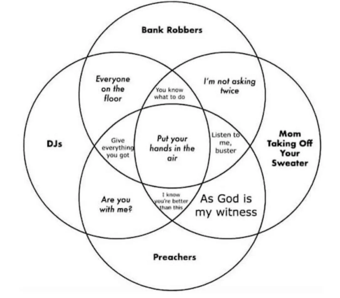
*borrowed image from https://nulab.com/learn/design-and-ux/funny-venn-diagrams-to-inspire-you/
It is a noble endeavor for comedians with a nerdy side, but I just don’t know how many people are in the “listen to me buster” group and I for one want to know…
Enter the “Upset” Plot. I’d argue it’s one of the best solutions to this “quantification” problem with set overlap visualization.
In the example below, the upset plot uses a grid layout to quantify both individual brewery instagram followings* (left bar plot) AND the overlap for followers that follow multiple breweries (top bar plot)

If I were visiting the Burlington, VT area, I’d make sure to visit BBCO and FOAM. That viz was created in R using the UpSetR package (github linked below)
https://github.com/hms-dbmi/UpSetR